Introduction#
This post explores TidyTuesday 32 from 2018-11-06: US Wind Turbine Data. Since the original date, there was an update to a couple of packages, and the code stopped working (mostly because of the tmap and sf packages). This is re-upload of the original post from 2018.
Libraries#
These are the libraries that I will use for TidyTuesday 32 exploratory analysis. The libraries are loaded in the first chunk of code. I am using tidyverse for data manipulation, tmap for plotting, rnaturalearth and rnaturalearthhires to get shape files for the USA, sf package to manipulate shape files, and tmaptools to crop the raster file.
library(tidyverse)
library(tmaptools)
library(tmap)
library(rnaturalearth)
library(rnaturalearthhires)
library(sf)
Data#
Now to upload data from TidyTuesday Github. The original page is available here.
# Load data
us_wind <- read_csv(file = "https://raw.githubusercontent.com/rfordatascience/tidytuesday/master/data/2018/2018-11-06/us_wind.csv")
Exploring Data#
Some basic data exploration functions, nothing too fancy.
dim(us_wind) # 24 columns and 58k rows
[1] 58185 24
head(us_wind) # The file looks cleanish but some variables are labeled as "missing"
# A tibble: 6 × 24
  case_id faa_ors faa_asn usgs_pr_id t_state t_county    t_fips p_name   p_year
    <dbl> <chr>   <chr>        <dbl> <chr>   <chr>       <chr>  <chr>     <dbl>
1 3073429 missing missing       4960 CA      Kern County 06029  251 Wind   1987
2 3071522 missing missing       4997 CA      Kern County 06029  251 Wind   1987
3 3073425 missing missing       4957 CA      Kern County 06029  251 Wind   1987
4 3071569 missing missing       5023 CA      Kern County 06029  251 Wind   1987
5 3005252 missing missing       5768 CA      Kern County 06029  251 Wind   1987
6 3003862 missing missing       5836 CA      Kern County 06029  251 Wind   1987
# ℹ 15 more variables: p_tnum <dbl>, p_cap <dbl>, t_manu <chr>, t_model <chr>,
#   t_cap <dbl>, t_hh <dbl>, t_rd <dbl>, t_rsa <dbl>, t_ttlh <dbl>,
#   t_conf_atr <dbl>, t_conf_loc <dbl>, t_img_date <chr>, t_img_srce <chr>,
#   xlong <dbl>, ylat <dbl>
# Test if there are any NAs:
sum(is.na(us_wind)) # results in zero but if I use View() for the data, it should be obvious, there's something wrong.
[1] 0
Visualisation and Summaries#
I’ve decided to explore my data visually/summarize them. There are some beautiful functions available to do this in one line, but I am consciously going for a ggplot2 solution with tidyr. The approach here is to separate data as either categorical or numerical type and then visualize/summarize them accordingly.
Categorical data#
# Looking at all categorical data is better via a simple summary
# There are 10 categorical or character data
us_wind %>%
  select(where(is.character)) %>%
  gather(key = "var_name", value = "var_content") %>%
  group_by(var_name, var_content) %>%
  summarise(total = n())
# A tibble: 102,818 × 3
# Groups:   var_name [10]
   var_name var_content      total
   <chr>    <chr>            <int>
 1 faa_asn  1987-AGL-900-OE      1
 2 faa_asn  1991-ANM-2340-OE     1
 3 faa_asn  1994-AWP-65-OE       1
 4 faa_asn  1995-AGL-2285-OE     1
 5 faa_asn  1995-ASW-1502-OE     1
 6 faa_asn  1997-ACE-1545-OE     1
 7 faa_asn  1997-ACE-1546-OE     1
 8 faa_asn  1997-AGL-3608-OE     8
 9 faa_asn  1997-ANM-1463-OE    15
10 faa_asn  1998-ACE-1038-OE     1
# ℹ 102,808 more rows
# I can see how many times missing occurs using the following lines
us_wind %>%
  select(where(is.character)) %>%
  gather(key = "var_name", value = "var_content") %>%
  group_by(var_name, var_content) %>%
  summarise(total = n()) %>%
  arrange(desc(total)) %>%
  filter(var_content == "missing") # Five out of ten have missing values
# A tibble: 5 × 3
# Groups:   var_name [5]
  var_name   var_content total
  <chr>      <chr>       <int>
1 t_img_date missing     24174
2 faa_ors    missing      8405
3 faa_asn    missing      8095
4 t_model    missing      4469
5 t_manu     missing      3876
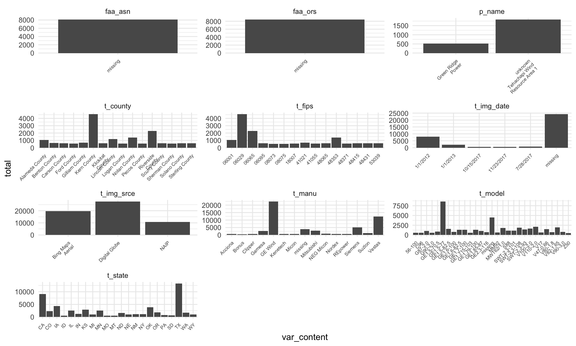
# Looking at this visually, it's better to use some cut-off value on total to reduce overplotting,
# and overall plotting time.
# For example, faa_asn, faa_ors are just missing, and I see the "missing" label in other columns too.
# It's clear I'll need to relabel "missing" as NA or deal with the missingness somehow.
us_wind %>%
  select(where(is.character)) %>%
  gather(key = "var_name", value = "var_content") %>%
  group_by(var_name, var_content) %>%
  summarise(total = n()) %>%
  arrange(desc(total)) %>%
  filter(total > 500) %>%
  ggplot(aes(x = var_content, y = total)) +
  geom_bar(stat = "identity") +
  facet_wrap(vars(var_name), scales = "free", ncol = 3) +
  scale_x_discrete(labels = function(x) str_wrap(x, width = 15)) +
  theme_minimal() +
  theme(axis.text.x = element_text(size = 6, angle = 45, hjust = 1))
Numerical data#
Once I visualized and summarized the categorical data, I can look at the rest of the data. In case of numerical data, I focused on visualizing only the complete dataset and dropped any missing values.
# Takes a while as I am using the whole data
# There are 14 numerical columns
# The obvious pattern is that some values (particularly those at -10 000) are represented quite a few times.
us_wind %>%
  select(where(is.numeric)) %>%
  gather(key = "var_name", value = "var_content") %>%
  ggplot(aes(x = var_content)) +
  geom_histogram() +
  facet_wrap(vars(var_name), scales = "free", ncol = 3) +
  scale_x_continuous(labels = function(x) str_wrap(x, width = 15)) +
  theme_minimal() +
  theme(axis.text.x = element_text(size = 6, angle = 45, hjust = 1))
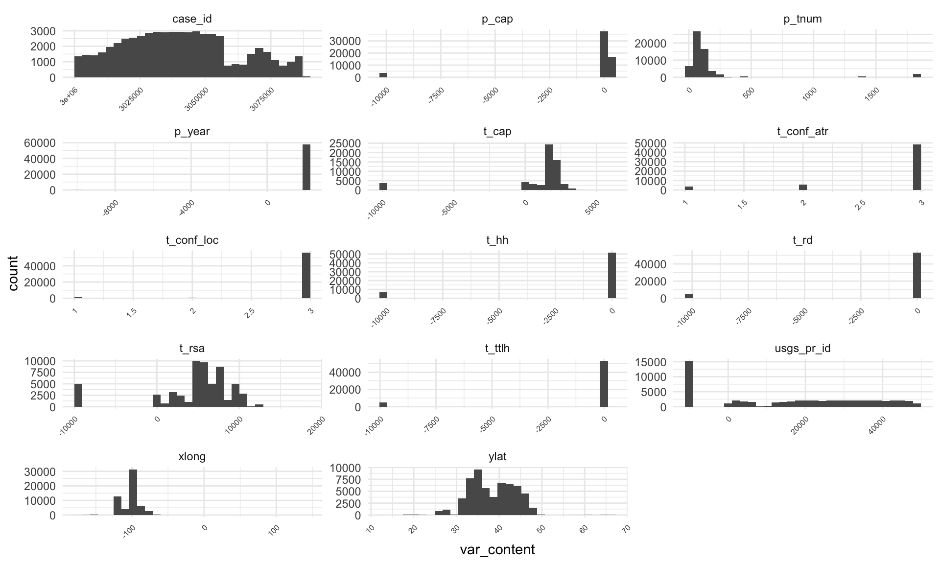
# I can see the occurrence of -9999 using the lines below...
us_wind %>%
  select(where(is.numeric)) %>%
  gather(key = "var_name", value = "var_content", -case_id) %>%
  group_by(var_name, var_content) %>%
  summarise(total = n()) %>%
  filter(total > 500) %>%
  arrange(desc(total)) %>%
  filter(var_content == "-9999") # 7 out of 14 columns contain -9999
# A tibble: 7 × 3
# Groups:   var_name [7]
  var_name   var_content total
  <chr>            <dbl> <int>
1 usgs_pr_id       -9999 15272
2 t_hh             -9999  6625
3 t_ttlh           -9999  5062
4 t_rd             -9999  4949
5 t_rsa            -9999  4949
6 t_cap            -9999  3694
7 p_cap            -9999  3692
Without going into too much detail, I can see that half of categorical variables are using labels “missing,” and half of numerical are using label “-9999”. After re-labeling these values as NAs, I can check if there are other missing values or issues. I am not really digging deep into this data though, and it’s possible more issues could be found.
Relabeling#
I’ve decided to go with the approach to relabel “-9999” and “missing” inputs as NAs.
# Relabel "-9999" and "missing"
us_wind_NA <-  us_wind %>%
     mutate(across(where(is.character), ~na_if(., "missing"))) %>%
     mutate(across(where(is.numeric), ~na_if(., 9999))) %>%
     mutate(across(where(is.numeric), ~na_if(., -9999)))

# Check the number of NA
sum(is.na(us_wind_NA)) # 93324
[1] 93324
Visualising without NAs#
I’ll assume data are tidy now or “tidier” and visualize them without the NA values in them. I am going to split them into categorical and numerical again.
Categorical data#
# Categorical
# I have decreased the total number. The NAs are removed, but what seems to be the case now
# is that some values are represented much more than others. I can plot the most common ones
# and check if there's anything strange.
us_wind_NA %>%
  select(where(is.character)) %>%
  gather(key = "var_name", value = "var_content") %>%
  group_by(var_name, var_content) %>%
  summarise(total = n()) %>%
  arrange(desc(total)) %>%
  filter(total > 100) %>%
  filter(!if_any(everything(), is.na)) %>%
  ggplot(aes(x = var_content, y = total)) +
  geom_bar(stat = "identity") +
  facet_wrap(vars(var_name), scales = "free", ncol = 3) +
  theme_minimal() +
  theme(axis.text.x = element_blank()) # There were too many labels.
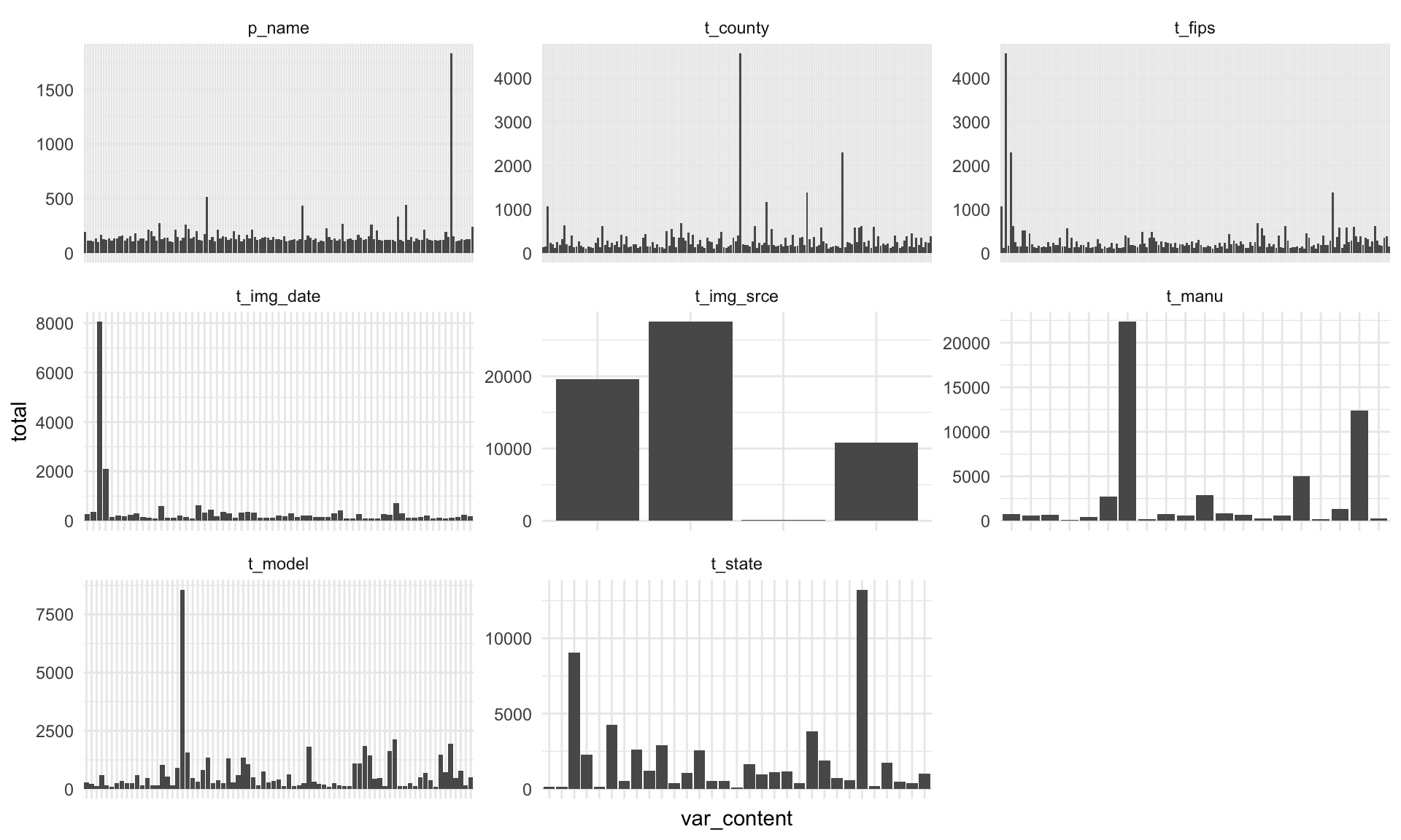
# The only variable might be intuitively strange is "unknown Tehachapi Wind Resource Area 1"
# It could be relabeled as "unknown"
us_wind_NA %>%
  select(where(is.character)) %>%
  gather(key = "var_name", value = "var_content") %>%
  group_by(var_name, var_content) %>%
  summarise(total = n()) %>%
  arrange(desc(total)) %>%
  filter(!if_any(everything(), is.na)) %>%
  filter(total == max(total))
# A tibble: 33 × 3
# Groups:   var_name [10]
   var_name   var_content                            total
   <chr>      <chr>                                  <int>
 1 t_img_srce Digital Globe                          27559
 2 t_manu     GE Wind                                22367
 3 t_state    TX                                     13232
 4 t_model    GE1.5-77                                8562
 5 t_img_date 1/1/2012                                8062
 6 t_county   Kern County                             4564
 7 t_fips     06029                                   4564
 8 p_name     unknown Tehachapi Wind Resource Area 1  1831
 9 faa_asn    2014-WTW-4834-OE                          76
10 faa_ors    18-020814                                  2
# ℹ 23 more rows
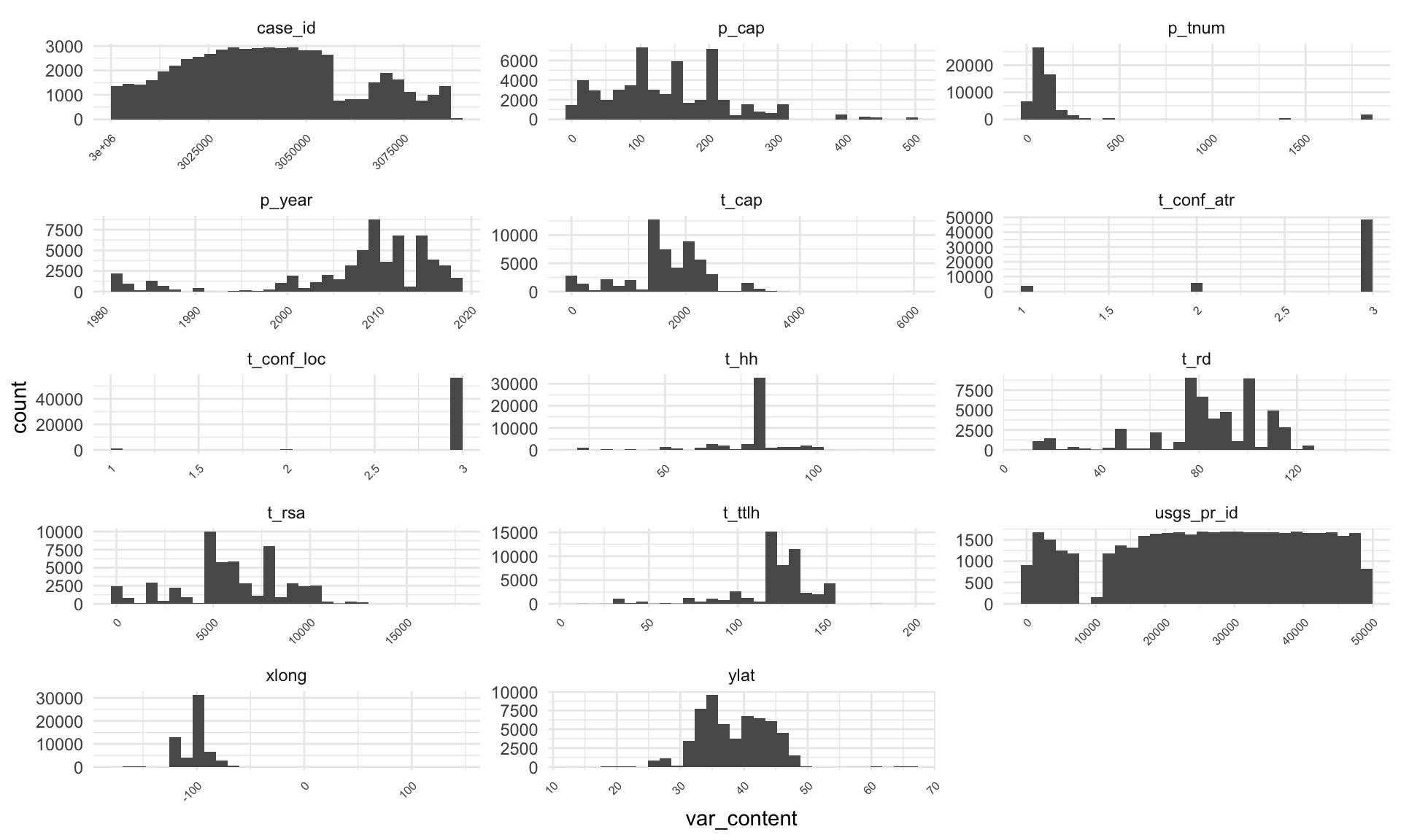
Numerical data#
# Numerical
# After removing all NAs, numerical columns look fine on the first glance.
us_wind_NA %>%
  select(where(is.numeric)) %>%
  gather(key = "var_name", value = "var_content") %>%
  filter(!if_any(everything(), is.na)) %>%
  ggplot(aes(x = var_content)) +
  geom_histogram() +
  facet_wrap(vars(var_name), scales = "free", ncol = 3) +
  scale_x_continuous(labels = function(x) str_wrap(x, width = 15)) +
  theme_minimal() +
  theme(axis.text.x = element_text(size = 6, angle = 45, hjust = 1))
Plot a map - Preparation#
Maps are probably one way to describe what is going on here. After completing this TidyTuesday, I saw other people’s maps and my approach is quite basic here. What I though was interesting is to plot the data against a geographical feature. While I am not an expert, I thought that altitude could be interesting. It turned out to be a bit more work than I expected as I had to get a raster map that has altitude data. It turns out there’s such a map (albeit in poor resolution) as data attached to the tmap package (I hope it’s tmap!).
I am going to be simple here and just summarize the number of plants without NAs and group them. I think it’s a possible approach but there’s one issue I don’t like. By summarizing I got rid of longitude and latitude. My next step will be to join it back by left_join() but perhaps there’s a nice way how to achieve it without losing this information. If anyone’s reading it, I’d be grateful for a comment :).
# Summarise the number of power plants from the dataset, exclude missing vars
map_us_wind <- us_wind_NA %>%
  mutate(t_state = paste0("US-", t_state)) %>% # Ensures state columns are identical
  filter(!if_any(everything(), is.na)) %>%
  group_by(t_state) %>% # Groups by state
  summarise(N_of_Wind = n()) %>% # Total N
  ungroup() # Removes grouping
I am using rnaturalearth to obtain a polygon shape file of the USA. It’s a really nice package to use for this task. I’ve discovered it only recently, so this is an ideal opportunity to try it out. The only issue is that I wanted only specific states, for example not Hawaii. I do not know how to call only specific parts from the natural earth; hence, I am simply filtering them out with an sf package (essentially a dplyr for shape files; and really cool package).
# Get a shapefile of the USA using the natural earth database
usa <- ne_states(country = "United States of America", returnclass = c("sf"))
I am obtaining the raster map from tmap. I’ll need to crop it against the polygon file. I’ve used the crop function that’s part of tmaptools.
# Get a raster of the same
data("land") # Load data from tmap
Here I am filtering out states and then joining the summarized us_wind data with them into a single shape file.
# I need only States, not all of the USA. I am using iso_3166_2 to get only
# the states I need. This is quite a crude method, but I did not figure out
# how to do it differently.

# The method relies on the package spdplyr for manipulating shapefiles.
states_fortyeight <- c("US-AL", "US-AZ", "US-AR", "US-CA", "US-CO", "US-CT", "US-DE", "US-FL", "US-GA", "US-ID", "US-IL", "US-IN", "US-IA", "US-KS", "US-KY", "US-LA", "US-ME", "US-MD", "US-MA", "US-MI", "US-MN", "US-MS", "US-MO", "US-MT", "US-NE", "US-NV", "US-NH", "US-NJ", "US-NM", "US-NY", "US-NC", "US-ND", "US-OH", "US-OK", "US-OR", "US-PA", "US-RI", "US-SC", "US-SD", "US-TN", "US-TX", "US-UT", "US-VT", "US-VA", "US-WA", "US-WV", "US-WI", "US-WY")

usa <- usa %>% filter(iso_3166_2 %in% states_fortyeight) %>%
  left_join(., map_us_wind, by = c("iso_3166_2" = "t_state")) # Merge with wind total
Below, I am obtaining only part of the raster map. The part relevant to the USA.
# Prepare shapes
sf_usa <- sf::st_as_sf(usa)
sf_land <- sf::st_as_sf(land)

# Get only a selection of the raster
usa_polygon_crop <- crop_shape(sf_land, sf_usa)
Plot a map - Plotting#
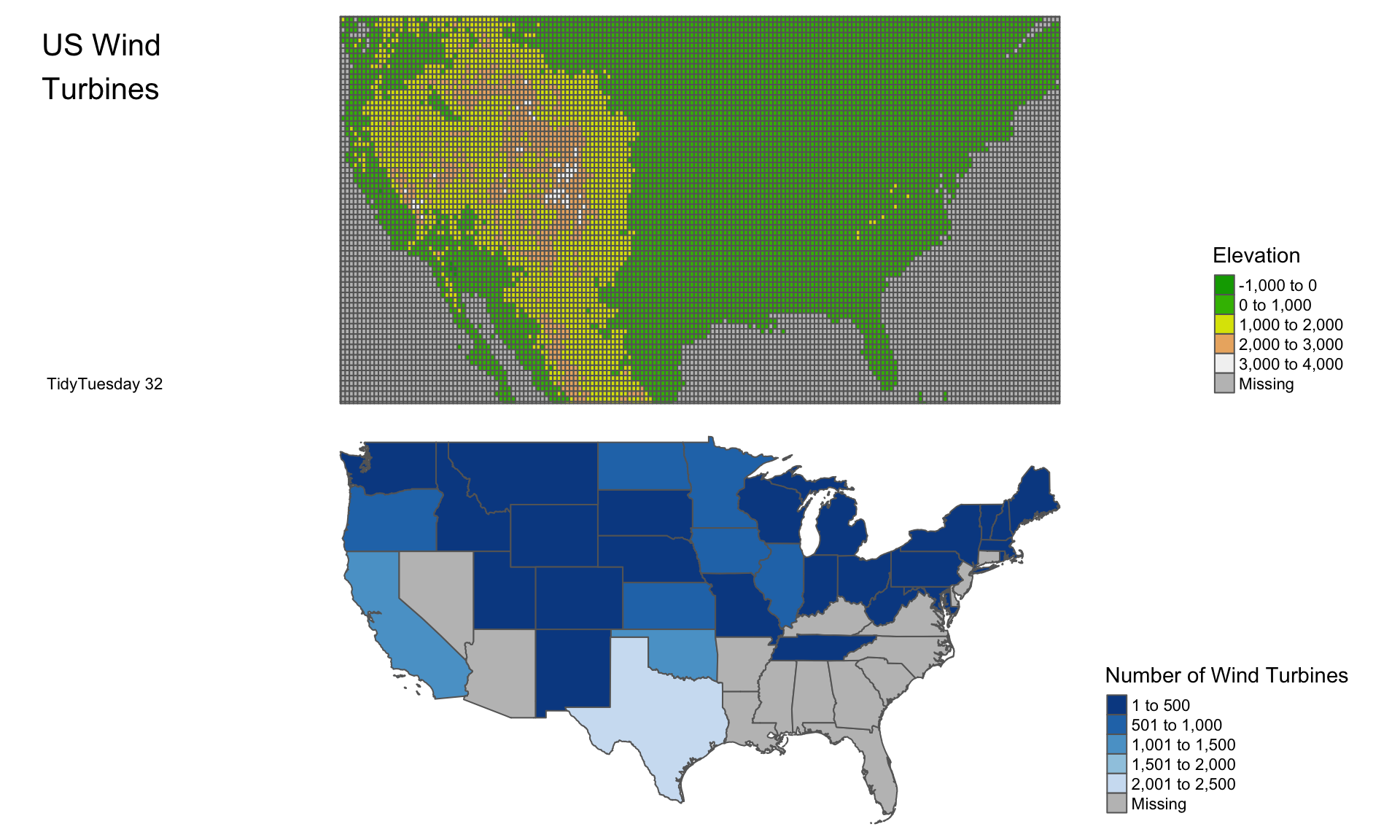
Now, I’m ready to plot both the raster with altitude and the polygon shape file with US wind data. For quite a while, I tried to overlay them as layers, but it wasn’t readable. It’s better to plot them side by side using a function from the tmap package.
# Save USA raster
usa_raster_wind1 <- tm_shape(usa_polygon_crop) +
  tm_polygons("elevation",
              palette = terrain.colors(10),
              title = "Elevation") +
  tm_credits("TidyTuesday 32",
             position = c("left", "bottom")) +
  tm_layout(title = "US Wind\nTurbines",
            title.position = c("left", "top"),
            legend.position = c("right", "bottom"),
            frame = FALSE)
# Save USA Wind poly
usa_poly_wind2 <- tm_shape(usa) +
  tm_polygons("N_of_Wind", title = "Number of Wind Turbines",
              palette = "-Blues")  +
tm_layout(legend.position = c("right", "bottom"),
          frame = FALSE)
Final plot#
For the final result, see below:
# Combine both together and plot it.
tmap_arrange(usa_raster_wind1, usa_poly_wind2)
That’s all I’ve done. I’m sure you can dig deeper into the data; I’ve used just a small amount of information from the original data. If you’d like to leave a comment, please don’t hesitate.
Reproducibility disclaimer#
Please note that this is an older post. While I can guarantee that the code below will work at the time the post was published, R packages are updated regularly, and it is possible that the code will not work in the future. Please see below the R.version to see the last time the code was checked. Future posts will improve on this.
R.version
               _
platform       aarch64-apple-darwin20
arch           aarch64
os             darwin20
system         aarch64, darwin20
status
major          4
minor          3.2
year           2023
month          10
day            31
svn rev        85441
language       R
version.string R version 4.3.2 (2023-10-31)
nickname       Eye Holes