Before You Start#
This post is about how to create your themes and palettes in Grammar of Graphics 2 (ggplot2). I assume you know what ggplot2 is and have a basic understanding of its functionality. I also assume you’ve used ggplot2 before but if you did not, you can watch the fantastic two parts webinar by Thomas Lin Pedersen. The first part is here and the second is here. I honestly think that it provides a very good overview of what ggplot2 is all about. To learn more about themes, please visit the ggplot2 help page, here. Finally, I assume you know how to create and use functions in R.
Firstly, I’ll need to load the necessary packages. I will be using ggplot2, colorspace, viridis, ggcorrplot, magrittr, and (at the time of writing this post) the new package called ggpattern that I’ve been looking forward to.
You can see the required packages in the snippet below. Except for ggpattern, all can be downloaded from CRAN. You’ll need to install the ggpattern using remotes::install_github("coolbutuseless/ggpattern").
library(ggplot2)
library(colorspace)
library(viridis)
library(ggpattern)
library(ggcorrplot)
library(magrittr)
[1] '3.4.4'

[1] '2.1.0'

[1] '0.6.4'

[1] '1.0.1'

[1] '0.1.4.1'

[1] '2.0.3'
Customise Your Theme#
The theme I will be developing here is aiming for simplicity, but this doesn’t mean yours can’t be a fancy one. Whichever style you are going for, I suggest you start building the theme from one of the default ggplot2 themes. The theme I am doing is built on theme_minimal() - a minimalistic theme that relies a lot on element_blank() function (which hides a given element in the theme).
Let’s look at the theme_minimal() below:
theme_minimal # Print the theme in the console without ().
function (base_size = 11, base_family = "", base_line_size = base_size/22,
    base_rect_size = base_size/22)
{
    theme_bw(base_size = base_size, base_family = base_family,
        base_line_size = base_line_size, base_rect_size = base_rect_size) %+replace%
        theme(axis.ticks = element_blank(), legend.background = element_blank(),
            legend.key = element_blank(), panel.background = element_blank(),
            panel.border = element_blank(), strip.background = element_blank(),
            plot.background = element_blank(), complete = TRUE)
}
<bytecode: 0x10a858078>
<environment: namespace:ggplot2>
First, you’ll see that the theme is using an additional theme inside of its function. Specifically, theme_bw() which in turn uses theme_gray() which when you call prints about 60 rows of code built inside the theme(). That is the function you will use to develop the theme.
To develop and customize the theme, you need to define a new function and copy the arguments inside theme_minimal(). The code below shows the final theme and how I’ve customized it:
project_theme <- function( # Define the function and its arguments
     base_text_size = 15, # Set the overall size of text elements
     base_text_axis_x_size = 12, # Set the size of text on the x-axis
     base_text_axis_x_angle = 90, # Set the angle of x-axis text
     base_text_axis_x_hjust = 1, # Make sure to keep the text in the center after adjusting the angle
     base_text_axis_x_vjust = 0.5 # `vjust` stands for vertical adjustment, `hjust` for horizontal
     ) {

# Define the theme.
# In my case, I am hiding lots of the elements to create a simple-looking plot.
# The elements I do need to control are defined with arguments, which will need to be set inside the function.
# I also don't want to set the arguments every time I call them, so I've created default values.

theme(axis.ticks = element_blank(),
      # The part before "=" determines what element of the plot will be modified.
      # The part after "=" determines what to do with the element. In this case, I'll hide it.
      legend.background = element_blank(),
      legend.key = element_blank(),
      panel.background = element_blank(),
      panel.border = element_blank(),
      strip.background = element_blank(),
      plot.background = element_blank(),
      text = element_text(size = base_text_size), # Arguments for the function:
      axis.text.x = element_text(size = base_text_axis_x_size,
                                 angle = base_text_axis_x_angle,
                                 hjust = base_text_axis_x_hjust,
                                 vjust = base_text_axis_x_vjust))
}
Now, the theme is going to behave like any other function, and you can reuse it for all your plots.
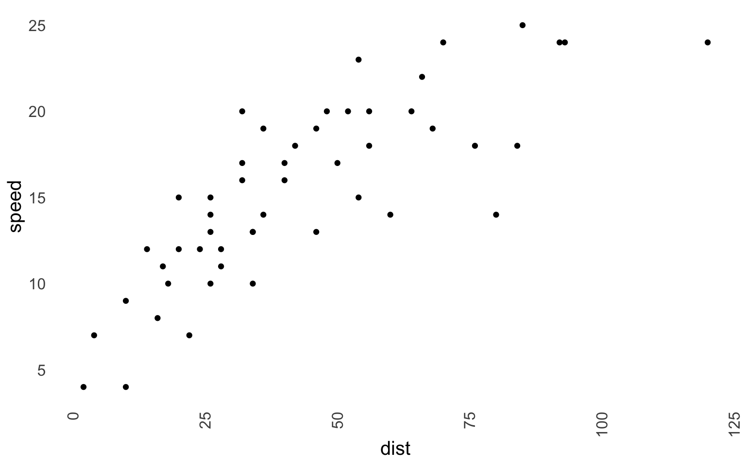
Option 1 is to use your theme every time you create a plot, like this:
ggplot(data = cars, aes(x = dist, y = speed)) +
     geom_point() +
     project_theme()
Option 2 is to set the theme using the ggplot function theme_set(). Then any plot you create will be using the set theme. This is preferred when you need to do a lot of visualizations, as typing theme_set() every time is somewhat tiring.
theme_set(project_theme()) # Set the theme.

ggplot(data = cars, aes(x = dist, y = speed)) +
     geom_point()
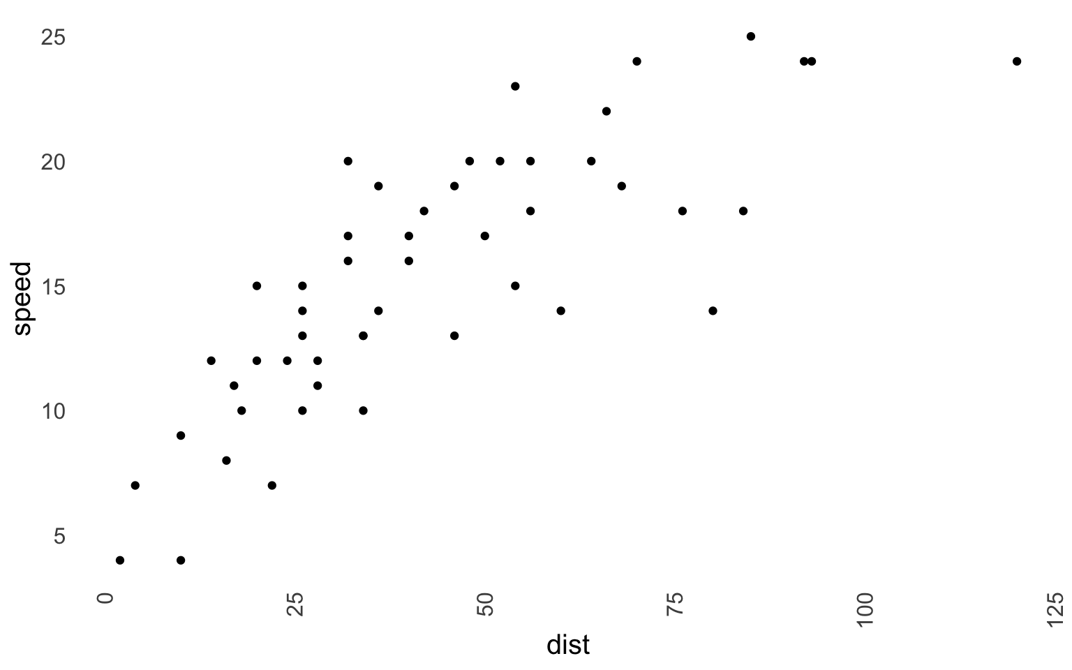
theme_set(theme_gray()) # Set the theme back to the default ggplot2 theme.
Besides theme_set(), you can also use other functions (click here) that ease the application of the theme. Specifically, theme_get(), theme_update(...), theme_replace(...). I invite you to explore the help page yourself.
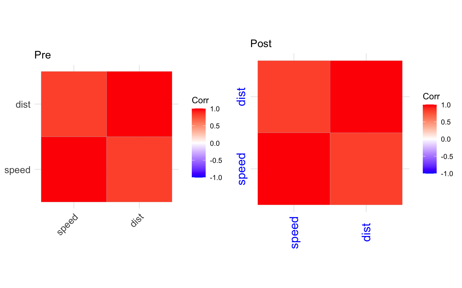
Unfortunately, the theme_set() does not seem to affect plots created by packages relying on ggplot2; however, in most cases, you can still use + theme() and modify these plots:
# The default output from ggcorrplot()
ggpre <- cars %>%
     cor() %>%
     ggcorrplot() +
     ggtitle("Pre")

# Using theme_update
ggpost <- cars %>%
     cor() %>%
     ggcorrplot() +
     theme(
     axis.text.x = element_text(angle = 90, vjust = 0.5, size = 15, hjust = 0.5, colour = "blue"),
     axis.text.y = element_text(angle = 90, vjust = 0.5, size = 15, hjust = 0.5, colour = "blue")
     ) +
     ggtitle("Post")

gridExtra::grid.arrange(ggpre, ggpost, ncol = 2)
Create Your Palette#
In every project, it’s good to use specific palettes to ensure colors are being used consistently across all your plots. I’ll assume that you know about how ggplot2 understands the colors or you can read on that here if you want.
Colors clearly make much more interesting plots and ease the interpretation. However, they should be used with caution as they can also mislead the interpretation if they are used incorrectly. Therefore, the best place to start using them is to use one of the pre-defined palettes. Luckily, ggplot2 has plenty of such palettes, and they are good if you don’t even want to install an additional package. I think you can’t go wrong with either viridis or ColorBrewer 2.
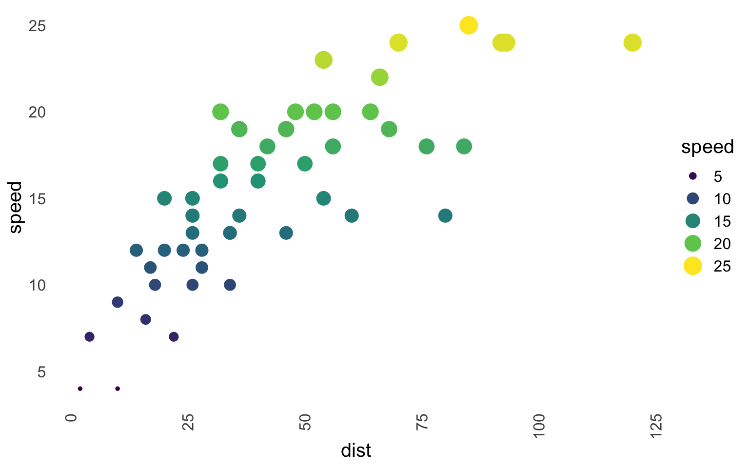
Viridis is used for continuous scales, and you can use viridis like this in ggplot2:
ggplot(data = cars, aes(x = dist, y = speed)) +
     geom_point(aes(size = speed, color = speed)) +
     scale_color_viridis_c(option = "D") + # `_c` is for continuous; "D" is for the palette option
     project_theme() + # I use the project theme I've defined above
     guides(color = "legend")
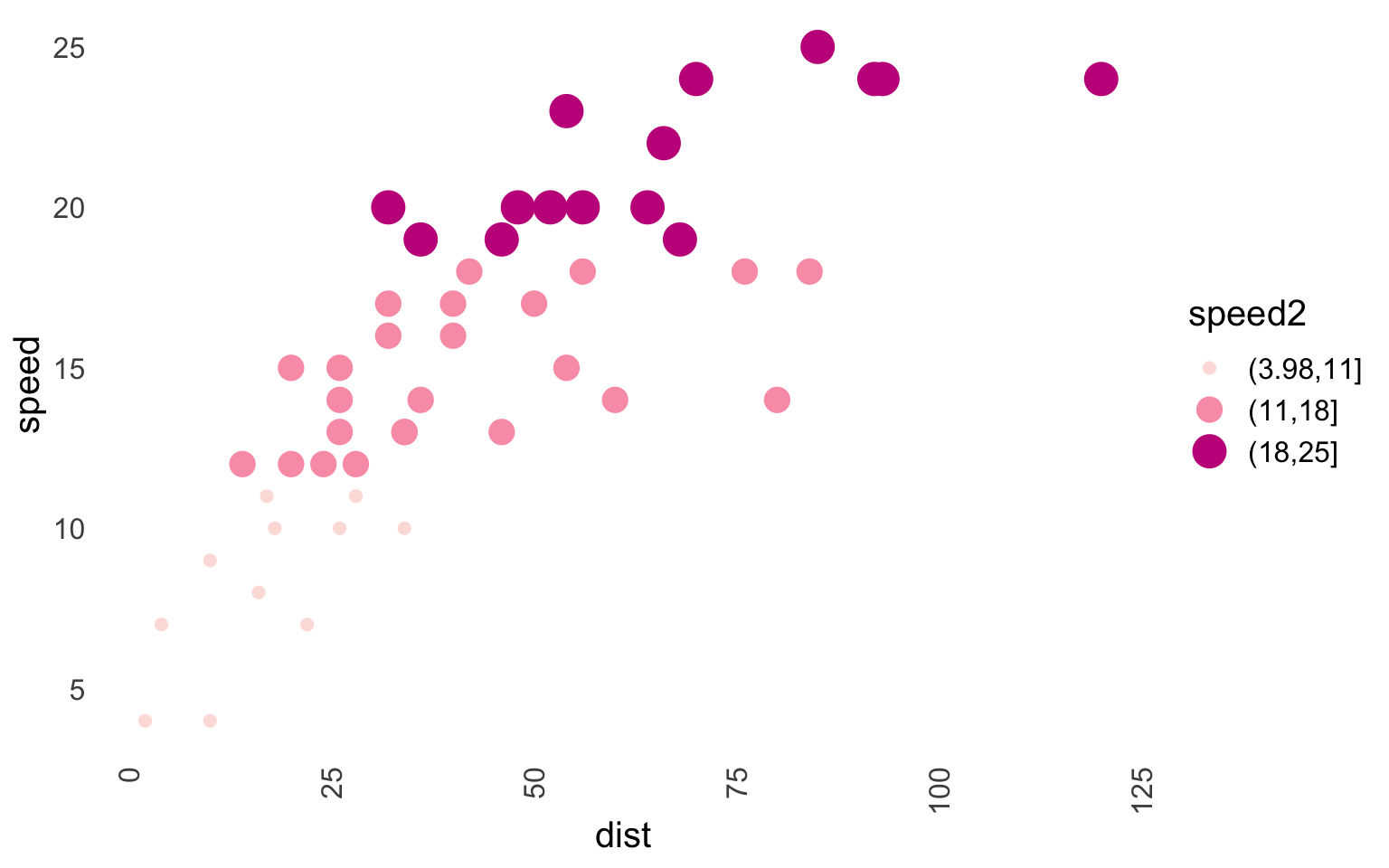
ColorBrewer is used for discrete scales, and to use it, ColorBrewer, do this:
cars$speed2 <- factor(cut(cars[, "speed"], 3)) # Since Brewer doesn't handle discrete scales, you need to convert any continuous variables to factors!

ggplot(data = cars, aes(x = dist, y = speed)) +
     geom_point(aes(size = speed2, color = speed2)) +
     scale_color_brewer(type = "seq", palette  = "RdPu") + # Seq is for sequential; "RdPu" is a palette type
     project_theme() + # I use the project theme I've defined above
     guides(color = "legend") # I used both size and color, this merges the legend.
Let’s create a custom palette. I’ll be using the colorspace package for this, and my aim here will be to create a gray palette that can be used for your boring academic journals, as most of them do hate colors. Before I’ll illustrate how I create my palette, I’d suggest exploring pre-defined palettes as they might be what you are looking for.
ColorBrewer offers one such palette, namely “Greys.” You can use it like this:
cars$speed2 <- factor(cut(cars[, "speed"], 3))

ggplot(data = cars, aes(x = dist, y = speed)) +
     geom_point(aes(size = speed2, color = speed2)) +
     scale_color_brewer(palette = "Greys") + #"Greys" is for a palette type
     project_theme() +
     guides(color = "legend")
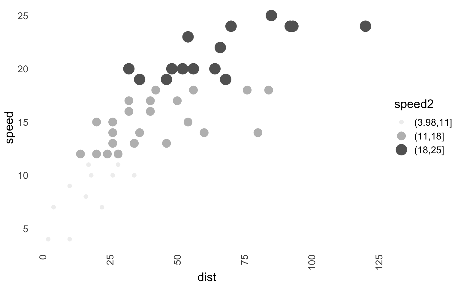
There are a few problems here. Firstly, I use a white background and you can’t see the light gray very well. Second, Brewer is meant to be used for discrete scales, and this makes it a bit annoying to use if you work with a continuous scale. Now enter the colorspace to save the day!
Let’s first talk about “Why?” colorspace package. There are several reasons:
- It is versatile and can be used for both discrete and continuous scales.
- It provides functions that allow you to experiment and test the palettes before you apply them.
- It can do all that Brewer does and more.
- The package is very well documented (vignettes, tutorials, shiny apps).
- Not limited to R only.
Firstly, there are two palettes in colorspace, specifically, hcl_palettes(n = 7, palette = "Light Grays", plot = TRUE) and hcl_palettes(n = 7, palette = "Grays", plot = TRUE). The chances are that these are what you are looking for; they look like this in plots:
cars$speed2 <- factor(cut(cars[, "speed"], 3))

gg1 <- ggplot(data = cars, aes(x = dist, y = speed)) +
     geom_point(aes(size = speed2, color = speed2)) +
     scale_color_discrete_sequential(palette = "Light Grays") + # Similar to color brewer
     project_theme() +
     guides(color = "legend") +
     ggtitle("Light Grays - discrete")

gg2 <- ggplot(data = cars, aes(x = dist, y = speed)) +
     geom_point(aes(size = speed2, color = speed2)) +
     scale_color_discrete_sequential(palette = "Grays") + # Similar to color brewer
     project_theme() +
     guides(color = "legend") +
     ggtitle("Grays - discrete")

gg3 <- ggplot(data = cars, aes(x = dist, y = speed)) +
     geom_point(aes(size = speed, color = speed)) +
     scale_color_continuous_sequential(palette = "Light Grays") + # Similar to color brewer
     project_theme() +
     guides(color = "legend") +
     ggtitle("Light Grays - continuous")

gg4 <- ggplot(data = cars, aes(x = dist, y = speed)) +
     geom_point(aes(size = speed, color = speed)) +
     scale_color_continuous_sequential(palette = "Grays") + # Similar to color brewer
     project_theme() +
     guides(color = "legend") +
     ggtitle("Grays - continuous")

gridExtra::grid.arrange(gg1, gg2, gg3, gg4, nrow = 2, ncol = 2)
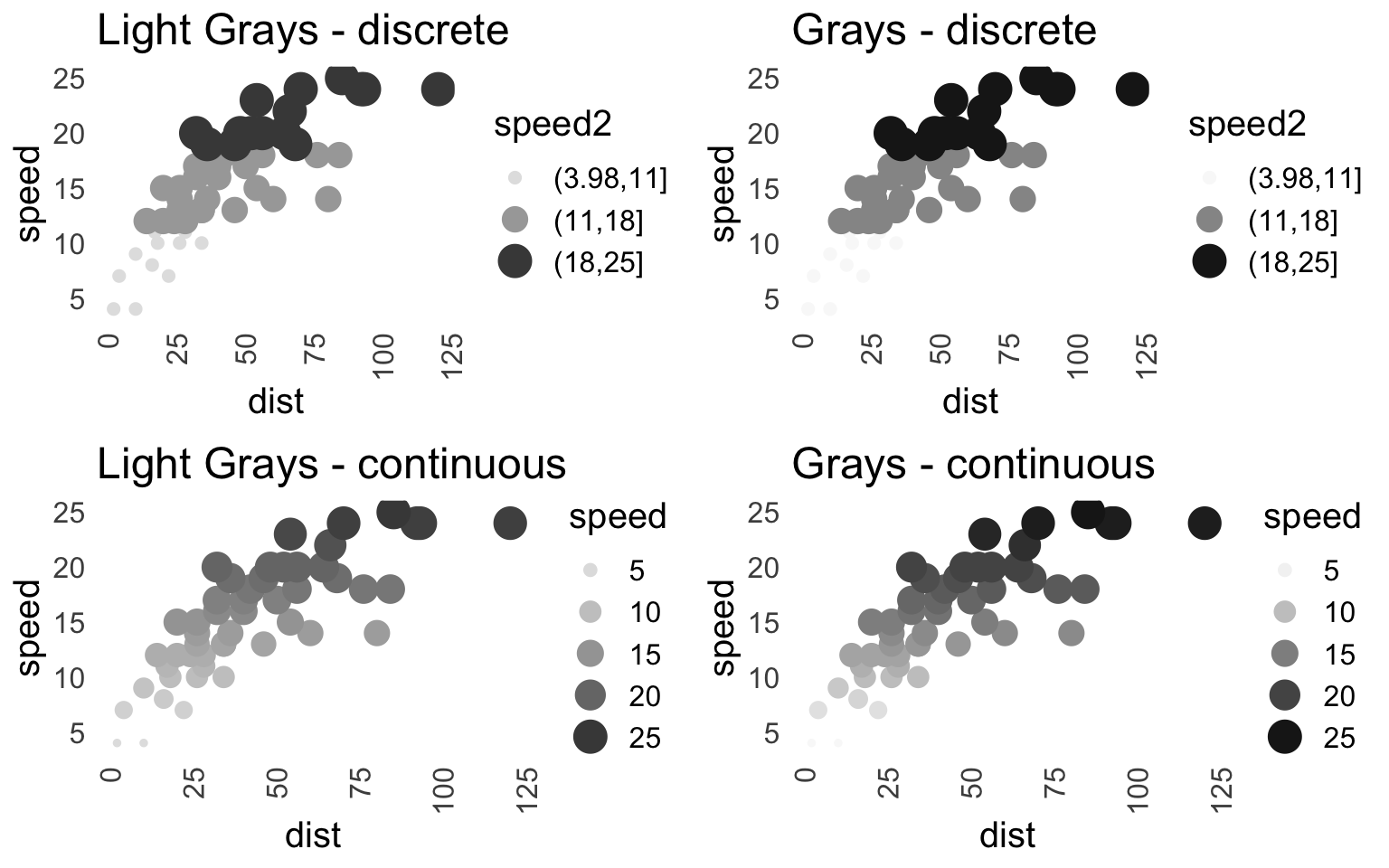
Chances are you are happy with these; however, if you still want to create your own - read further.
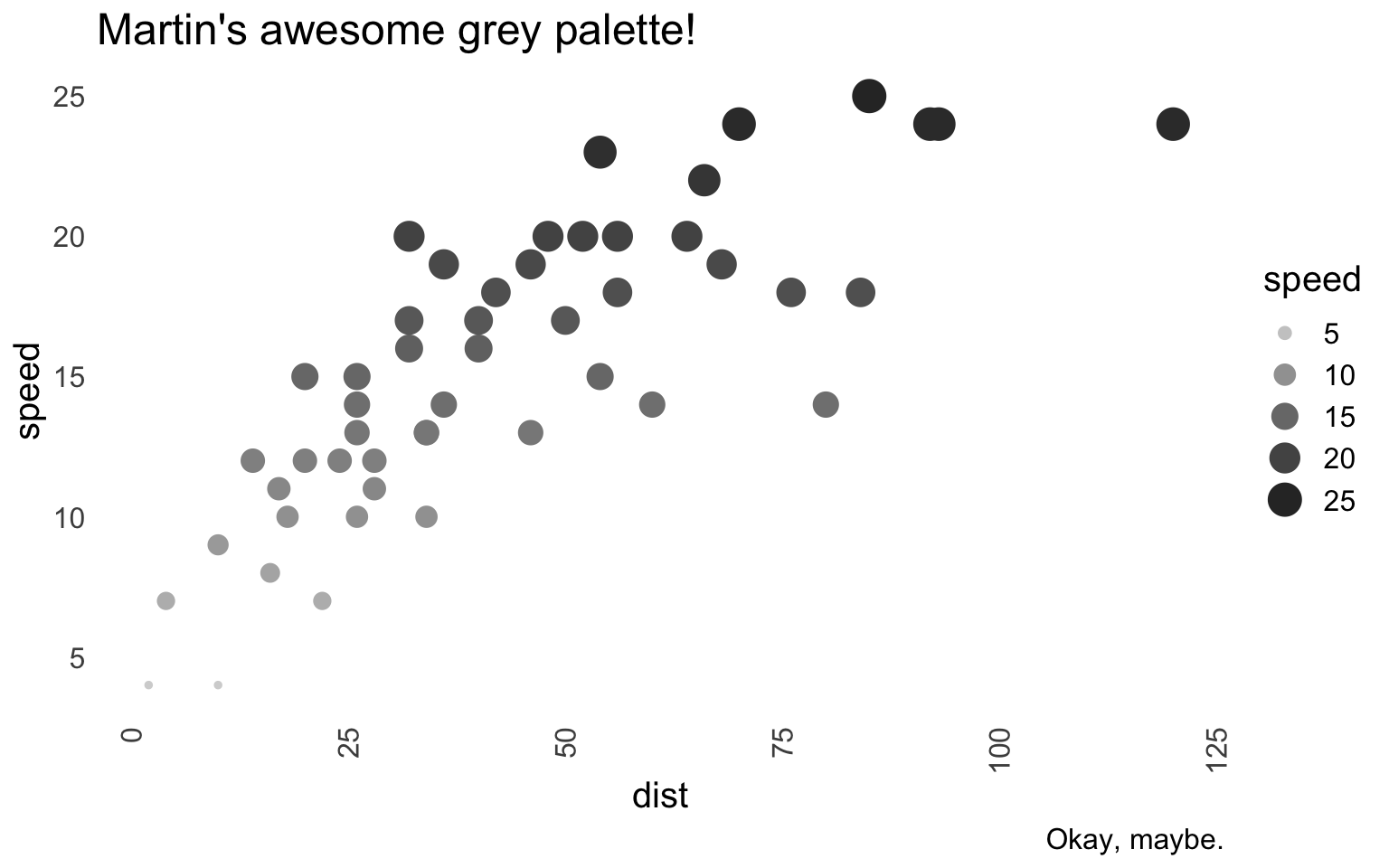
To start creating a palette, I’d urge you to either call hcl_wizard() in the console or visit the corresponding page where you can use the “Palette Creator”. You then can explore available palettes and customise them. There is so much documentation available that I won’t cover the process; it is also quite an intuitive app to use. In short, the hcl_wizard takes you to an app with various sliders which you can adjust to create the palette. Once you are done, you’ll go to the “Export” page and select the “R” tab. You’ll see (depending on what you’ve created) something like this: qualitative_hcl(n = 7, h = c(30, -330), c = 50, l = 70, register = )
In my case, I’ve been trying to create a grey palette (you can see such palettes under “Basic: Sequential (single-hue)”) that doesn’t rely on white at the end of one color spectrum because I use a white background in my theme. I also wanted to avoid light grey and pick fewer (n = 5) but distinguishable shades of color. I proceeded to create it in hcl_wizard() and tried it on a couple of my plots. This is the result:
palette_gray_mc <- colorspace::sequential_hcl(n = 5, h = c(-360, -360),
                                              c = c(0, 0, 0), l = c(20, 85),
                                              power = c(0, 1), fixup = FALSE,
                                              register = "palette_gray_mc")
You’ll also see that I’ve used the “register” option of my palette but also saved it in a vector. The reason for saving it in the vector is that I often need to use only one of the colors. So, I save the individual colors like this:
# Colors from the palette above pal_gray_mc.
color_e <- "#D4D4D4"
color_d <- "#A8A8A8"
color_c <- "#7D7D7D"
color_b <- "#555555"
color_a <- "#303030"
Finally, to use the palette, I can either pick a color and use it outside aes() of ggplot, e.g.: color = color_a, but since I’ve registered the palette, the proper way is to do this:
ggplot(data = cars, aes(x = dist, y = speed)) +
     geom_point(aes(size = speed, color = speed)) +
     scale_color_continuous_sequential(palette = "palette_gray_mc") + # Use it like this!
     project_theme() +
     guides(color = "legend") +
     labs(title = "Martin's awesome grey palette!",
          caption = "Okay, maybe.")
When Even Shades of Grey Fail You#
Sometimes I feel that no matter what shade of grey I use, it’s no good. However, that’s where ggpattern comes into play. I won’t talk about the package much as it’s still an early release and may change a lot in the future, but I think a lot of people may benefit from using it.
Using the cars dataset, thanks to ggpattern, I can plot the speed in a bar chart like this:
cars$speed2 <- factor(cut(cars[, "speed"], 3))  # Let's use our modified cars dataset

ggplot(data = cars) +
  geom_bar_pattern(
       aes(speed2, pattern = speed2, pattern_angle = speed2),
       pattern = "stripe",
       fill    = "white",
       color   = "black") +
     project_theme() +
     theme(legend.position = 'none') +
     labs(x = "Speed (factor)", y = "Frequency")
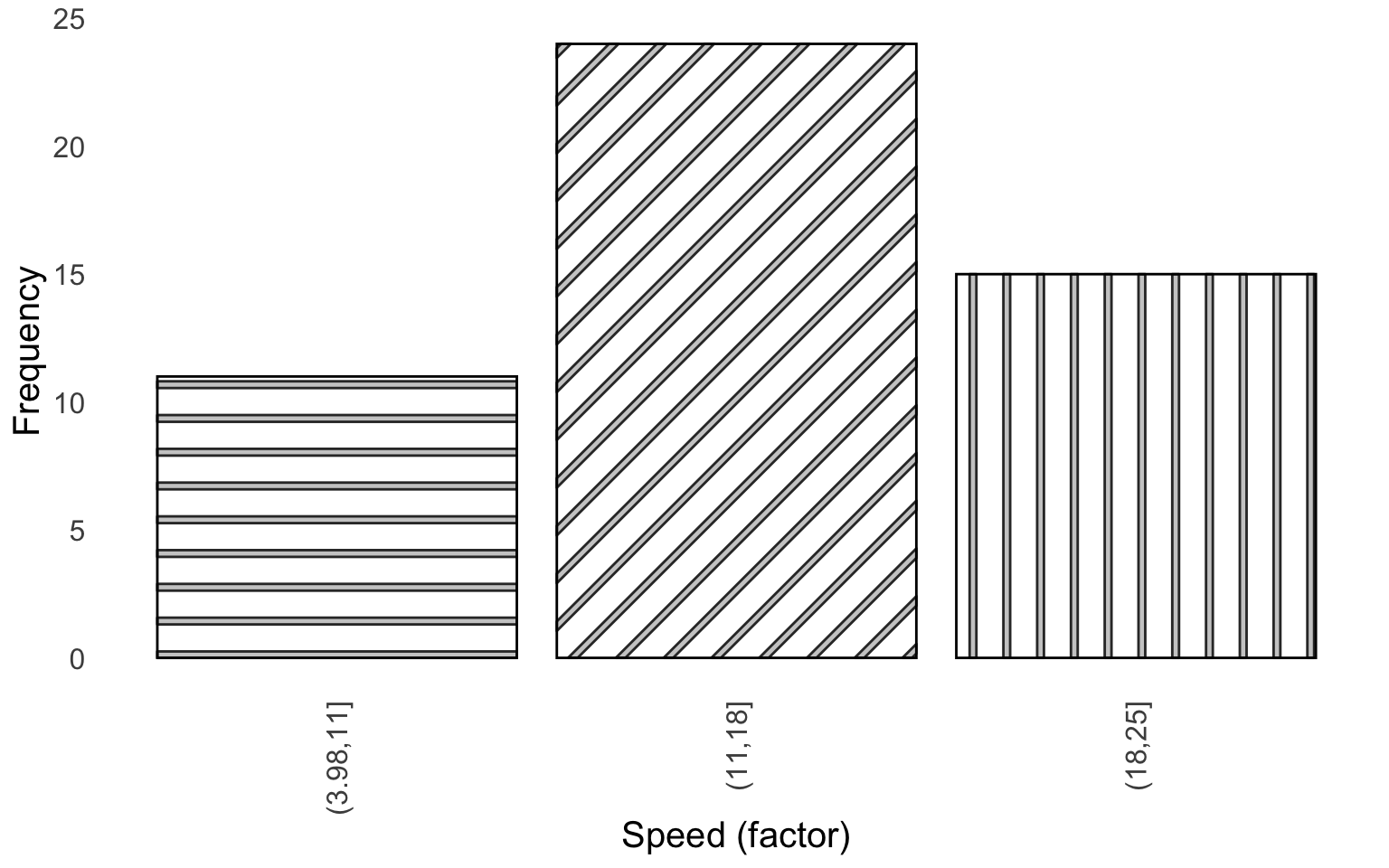
This is useful as I don’t have to scratch my head around which shade of grey is different from another shade of grey (trust me, it’s sometimes impossible to tell).
Thank You#
Thank you very much for reading the post, and I hope you’ve found it useful. I have not been posting at all, but I want to start again. Since it takes some time to create a post like this, any feedback or interest will help me to continue doing this (especially if you liked it and found it useful).
Reproducibility Disclaimer#
Please note that this is an older post. While I can guarantee that the code below will work at the time the post was published, R packages are updated regularly, and it is possible that the code will not work in the future. Please see below the R.version to see the last time the code was checked. Future posts will improve on this.
               _
platform       aarch64-apple-darwin20
arch           aarch64
os             darwin20
system         aarch64, darwin20
status
major          4
minor          3.2
year           2023
month          10
day            31
svn rev        85441
language       R
version.string R version 4.3.2 (2023-10-31)
nickname       Eye Holes